
What Does a Building’s Layout Actually Do for Your Daily Life?
How Architectural Design Shapes the Spaces Where You Live, Work, and Thrive
When a space feels disjointed or fails to support how you actually live, architectural design steps in to weave function and feeling into a cohesive whole. It works by balancing light, proportion, material, and movement, translating your daily needs into a built environment that flows naturally. The benefit is a home or building that reduces friction—where every corner serves a purpose and every transition feels intuitive—rather than forcing you to adapt to awkward layouts. Approach it by first documenting your routines and spatial frustrations, then letting those insights guide the arrangement of walls, openings, and volumes.
What Does a Building’s Layout Actually Do for Your Daily Life?
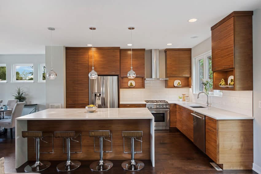
A building’s layout silently scripts your daily movements, deciding whether transitions feel seamless or exhausting. In architectural design, the placement of walls, doors, and corridors dictates your path from waking to sleeping—shaping how much time you spend fetching, cleaning, or simply walking. A well-considered layout groups noisy and quiet zones, so morning routines don’t disturb a sleeping partner, while sightlines from kitchen to living area let you supervise children without shouting. Circulation width and door swings affect how easily you carry groceries or navigate with a stroller, and storage proximity reduces the friction of daily put-away.
A layout’s true power lies in eliminating wasted motion, turning habitual actions into effortless sequences.
By aligning spatial flow with your actual habits—like placing laundry near bedrooms or work near natural light—architectural design converts abstract floor plans into a tangible reduction of daily stress and physical fatigue.
How Spatial Flow and Room Placement Shape Your Routines
The sequence of rooms dictates your kinetic habits more than aesthetics ever will. A poorly placed laundry room forces you to traverse the entire floor plan repeatedly, adding micro-delays to every cycle. Conversely, positioning the mudroom directly off the kitchen’s entry point shortens the unloading path from car to counter, making grocery storage feel almost automatic. Spatial flow and room placement shape your routines by either compressing or stretching the distance between related activities. When the bathroom opens into the bedroom rather than the hallway, your morning privacy increases but your shared access becomes awkward for guests. This is why zoning—quiet versus active areas—matters: it aligns your circadian rhythm with the building’s geometry.
Q: How does room placement alter a daily commute inside your home?
A: If the home office sits adjacent to the living room, you’ll likely blend work and leisure, whereas a separate wing creates a mental break that reinforces starting and stopping times.

Why Natural Light Zones Matter More Than Square Footage
A home’s square footage is an abstract number, but natural light zones dictate how your body and mind actually feel every hour of the day. A sprawling floor plan with a dark core forces you to rely on artificial lighting, creating a cave-like rhythm that disrupts your circadian cycle. Conversely, a compact layout with strategically placed light wells and south-facing apertures gives you bright mornings for alertness and softer, warmer afternoon zones for winding down. The true value of a room emerges not from its dimensions but from where the sun reaches it at 8 a.m. versus 6 p.m. You will naturally gravitate toward these bright pockets for reading, work, or meals—making a 700-square-foot studio feel more spacious than a 2,000-square-foot dim layout.

- A bright breakfast nook outperforms a dark formal dining room for daily energy and appetite.
- Moving a desk near a daylight zone reduces eye strain and boosts focus more than adding floor area.
- Even a narrow hallway with a skylight makes movement feel effortless, unlike wide, shadowed corridors.
Key Elements That Separate a Good Floor Plan from a Great One
A good floor plan organizes spaces efficiently, but a great one orchestrates the lived experience through spatial flow and visual connection. The key differentiator lies in how circulation zones are designed—not merely as corridors, but as transitional experiences that frame sightlines between key living areas. A great plan manipulates natural light penetration, using window placement and interior glazing to create dynamic daylight gradients throughout the day. It also anticipates furniture zoning, ensuring each wall has dedicated purpose without dead corners. Acoustic separation between noisy and quiet zones, achieved through strategic buffering (closets, stairs), elevates comfort beyond mere square footage. Ultimately, the distinction rests on adaptive flexibility in layout: built-in storage that supports multiple future uses, and room proportions that feel generous without wasted area, creating a seamless dialogue between structure and human activity.
Proportions, Ceiling Heights, and the Feel of Openness
Proportions dictate how a room’s length, width, and volume interact, and when they align harmoniously, the space feels inherently balanced rather than awkwardly stretched or cramped. Ceiling heights act as the silent regulator of this equilibrium—a nine-foot ceiling in a narrow hallway creates a vertical chasm, while the same height in a wide living area fosters a grounded, expansive calm. The true measure of a great plan lies in how these dimensions orchestrate the feel of openness, where generous vertical clearance meets carefully scaled floor spans, allowing light and air to circulate without sacrificing intimacy. Overly tall ceilings in small rooms become cavernous; too-low ceilings in large rooms feel oppressive. The finest designs modulate height and proportion together, producing a seamless, breathable flow that makes every square foot feel deliberate and inviting.
The Role of Circulation Paths and Hidden Visual Connections
Circulation paths are the quiet choreographers of a great floor plan, guiding movement while hidden visual connections turn mere transit into layered experience. A corridor that subtly frames a glimpse of the garden, or a stair landing that peeks into a double-height living space, makes every step feel intentional rather than utilitarian. The best plans weave these sightlines into the path itself—so you discover a niche, a material shift, or a borrowed daylight moment just as you turn. It is the withheld glimpse, not the open view, that makes a house feel expansive. When circulation aligns with what you see ahead, the plan gains rhythm and quiet surprise.
- Offset doorways and wall cuts to create sequential reveals along a hallway.
- Use a change in ceiling height or flooring material to mark a transition without full enclosure.
- Place a focal point (art, window, hearth) at the end of a path to draw movement and anchor orientation.
- Bridge adjacent spaces with a slim slot or clerestory to maintain privacy while permitting shared light and glances.
How Material Textures and Color Palettes Alter Perceived Space
Material textures and color palettes directly manipulate depth perception and spatial volume. Rough, matte surfaces absorb light, visually pulling walls inward and shrinking a floor plan, while glossy or reflective finishes bounce illumination outward, expanding perceived boundaries. Dark, saturated hues advance, making oversized rooms feel intimate, whereas pale, cool tones recede, opening narrow corridors. Strategic texture zoning—pairing smooth flooring with coarse accent walls—guides movement and defines functional pockets without physical partitions. A continuous, monochromatic palette across surfaces erases visual interruptions, tricking the eye into reading a larger, seamless footprint. Conversely, high-contrast color blocking at thresholds fragments sightlines and breaks spatial continuity. The table below compares applied effects:
| Approach | Perceived Effect |
|---|---|
| High-gloss, light tones | Expands and lifts ceiling height |
| Deep matte textures | Compresses and adds coziness |
| Uniform neutral palette | Extends depth and flow |
| Mixed accent textures | Creates focal zones and reduces scope |
How to Brief a Designer So You Get the Style You Want
To get the architectural style you want, start by collecting images—not of entire buildings, but of specific *feelings*: the way morning light rakes across a plaster wall, the heaviness of a stone threshold, the silence of a double-height void. Describe the experience you want to live, not the catalogue of features you think you need. Tell your designer about the house you grew up in, the hotel lobby that made you slow down, the museum stairwell you kept climbing. Then, hand them a list of three adjectives—like *monastic, warm, grounded*—and ask them to push back if the words clash. Finally, create a “no-go” board of styles you hate, explaining *why* each one repels you. This gives the architect boundaries without handcuffing their creativity.
The real brief is written in your daily rituals—how you want to wake, cook, read—not in Pinterest boards.
End the meeting divine home by asking them to verbally walk you through how your style choices will change your actual movements through the space.
Turning Your Lifestyle Needs into Clear Spatial Priorities
To turn lifestyle needs into clear spatial priorities, start by listing your non-negotiable daily rituals—then map each to a room’s size, light, or flow. If you work from home but eat out often, a compact kitchen with a dedicated, noise-proof home-office zone beats a sprawling dining area. For families, allocate square footage to shared circulation over formal living space; for empty nesters, prioritize a ground-floor primary suite and a hobby studio over guest rooms. Rank each need as “must,” “should,” or “nice” before meeting your designer. This hierarchy lets you trade square meters deliberately—sacrificing a rarely-used guest bedroom for a double-width hallway that doubles as a library.

Choosing Between Open-Plan, Zoned, or Hybrid Configurations
When you’re briefing a designer, nailing the layout is about how you actually live, not just square footage. Open-plan feels fantastic for parties and keeping an eye on kids, but it can turn into a noisy, cluttered fishbowl. Zoned layouts give you quiet corners and defined spaces for focused work, though they can feel boxy if walls multiply. A hybrid configuration often wins because it blends a large social core with partial partitions—like a sliding door or a low bookshelf—so you get sightlines without sacrificing acoustic privacy. Tell your designer which rooms you use at the same time, and whether you prioritize conversation flow or escape. That’s the real decision driver.
Ways to Maximize Comfort and Efficiency Through Design Choices
Passive solar design, with its deep overhangs and thermal mass, turns a wall into a silent partner in the daily rhythm of light and shade. You position windows to capture winter sun while shielding summer glare, letting the structure itself breathe and adjust. Cross-ventilation through operable clerestory windows draws cool air upward, while insulated, earth-bermed foundations keep floors warm without a single extra watt. The kitchen’s work triangle flows into a south-facing breakfast nook, so morning coffee happens where the sun lands first. Yet the true magic is in the threshold—a mudroom that captures coats and chill, keeping the main living space untouched. This is how a house anticipates your needs before you speak them, where every corner feels inevitable, not invented.
Passive Solar Orientation and Ventilation Strategies
Passive solar orientation and ventilation strategies transform a building into a living climate response. By aligning the longest facade along the east-west axis, you capture low winter sun while shading harsh summer rays with deep overhangs. Thermal mass—like concrete or stone—absorbs daytime heat and releases it at night, stabilizing indoor temperatures. For airflow, position operable windows on opposing pressure zones: low on the windward side, high on the leeward side, to drive natural cross-ventilation. Stack effect works vertically—place inlet vents low and exhaust high, allowing warm air to rise and escape. Follow this sequence:
- Map seasonal sun angles and prevailing breezes on your site.
- Place main living spaces on the south face for sunlight.
- Install high-performance glazing on that side only.
- Add thermal mass floors or walls in direct sun paths.
- Locate vents and clerestories to boost night-flush cooling.
This integration cuts mechanical loads dramatically while keeping interiors naturally comfortable year-round.
Integrating Storage and Utility Spaces Without Sacrificing Aesthetics
Blending storage and utility into your home’s design is all about making function feel invisible. Instead of bulky closets, try built-in cabinetry that follows the wall’s line, painted to match your trim for a seamless look. Tuck laundry or mechanicals behind paneled doors that mimic surrounding millwork, or use a sliding barn door to hide a mudroom without losing character. Open shelving in a pantry can become a display for jars and baskets, turning necessity into décor. Even radiators can double as sleek bench seating. The trick is choosing finishes and proportions that feel intentional, not added on. Integrated utility design means every broom and boiler has a home that looks as good as the living room.
Cleverly disguised panels, multi-purpose furniture, and coordinated finishes let you hide clutter and systems, proving that utility never has to look utilitarian.
Common Mistakes People Make When Reviewing Drawings and Models

When reviewing architectural drawings, the most common mistake is staring at the pretty renderings while ignoring the dimension strings—so you approve a facade that’s 30 centimeters too shallow for the furniture you promised the client. Another trap is checking only the floor plan in isolation, never flipping to the section cut, which is where you discover the ceiling height collides with the structural beam. People also skim the model from a fixed eye level, missing how the roofline steals light from the neighbor’s courtyard—a problem that only appears when you orbit the model at noon, tracing shadows like a detective. Finally, they fixate on the material texture instead of the door swing radius, then wonder why the bathroom door hits the toilet. Always trace the circulation path in both 2D and 3D, and check every junction where wall meets roof, because that’s where water and regret both find their way in.
Overlooking Scale, Ergonomics, and Furniture Fit

When you’re glued to the screen, it’s easy to fall for a plan that looks perfect—until you realize the sofa swallows the living room or the bed blocks the closet doors. **Overlooking scale, ergonomics, and furniture fit** is a classic trap because human bodies and real furniture don’t shrink to match your zoom level. A 1200mm-wide hallway might feel fine on paper, but two people can’t pass comfortably. Always check clearances: 900mm for a chair pull-out, 600mm for a main walkway, and at least 450mm between the coffee table and sofa. Also, test the door swing—does it hit the dresser? And that gorgeous island? It needs 1200mm of clearance behind stools for a comfortable sit. Print your drawings at 1:50, grab a tape measure, and stand in the space. Your back—and your guests—will thank you.
Double-check every dimension against real human reach and real furniture sizes before you commit—scale, ergonomics, and fit are what turn a pretty drawing into a livable home.
Ignoring How Exterior Views and Neighboring Structures Affect Interior Design
When reviewing drawings, overlooking how exterior views and neighboring structures shape interior spaces leads to compromised layouts. A window framing a brick wall or a balcony overlooking a parking lot dictates furniture placement, glare control, and privacy, yet many reviewers focus solely on interior partitions. Ignoring these external factors results in seating oriented toward blank facades or living areas exposed to adjacent windows. **Contextual interior planning** must account for sightlines, sun angles, and noise from nearby buildings. Before approving a plan, trace each primary view from every opening—if the outlook is poor, reposition functions or adjust fenestration. This prevents costly post-construction fixes.
Q: How do neighboring structures change interior design decisions?
A: They force you to shift private zones away from overlooking windows, use frosted glass or high sills for visual privacy, and orient circulation to avoid direct sightlines into adjacent units.
Signs You Need to Rethink a Design Before Construction Begins
If you notice recurring circulation bottlenecks in the 3D model—where door swings clash or corridors narrow unexpectedly—that’s a clear sign your design needs pre-construction revision. Similarly, when ceiling heights or structural gridlines force awkward window placements, or when MEP routes visibly collide with ductwork, stop and rethink. A drawing that looks clean in plan but fails in section will always cost more to fix on site. Also flag any room where furniture layout contradicts the window or door schedule. Before pouring foundations, verify these signals in order:
- Simulate daily movement and check for pinch points.
- Cross-check all reflected ceiling plans against structural depths.
- Review vertical clearances at every threshold and stair landing.
If any step reveals ambiguity, redesign now—not after excavation.